Strategy & Vision
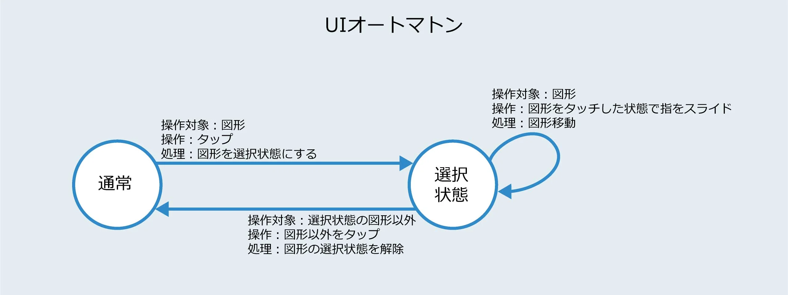
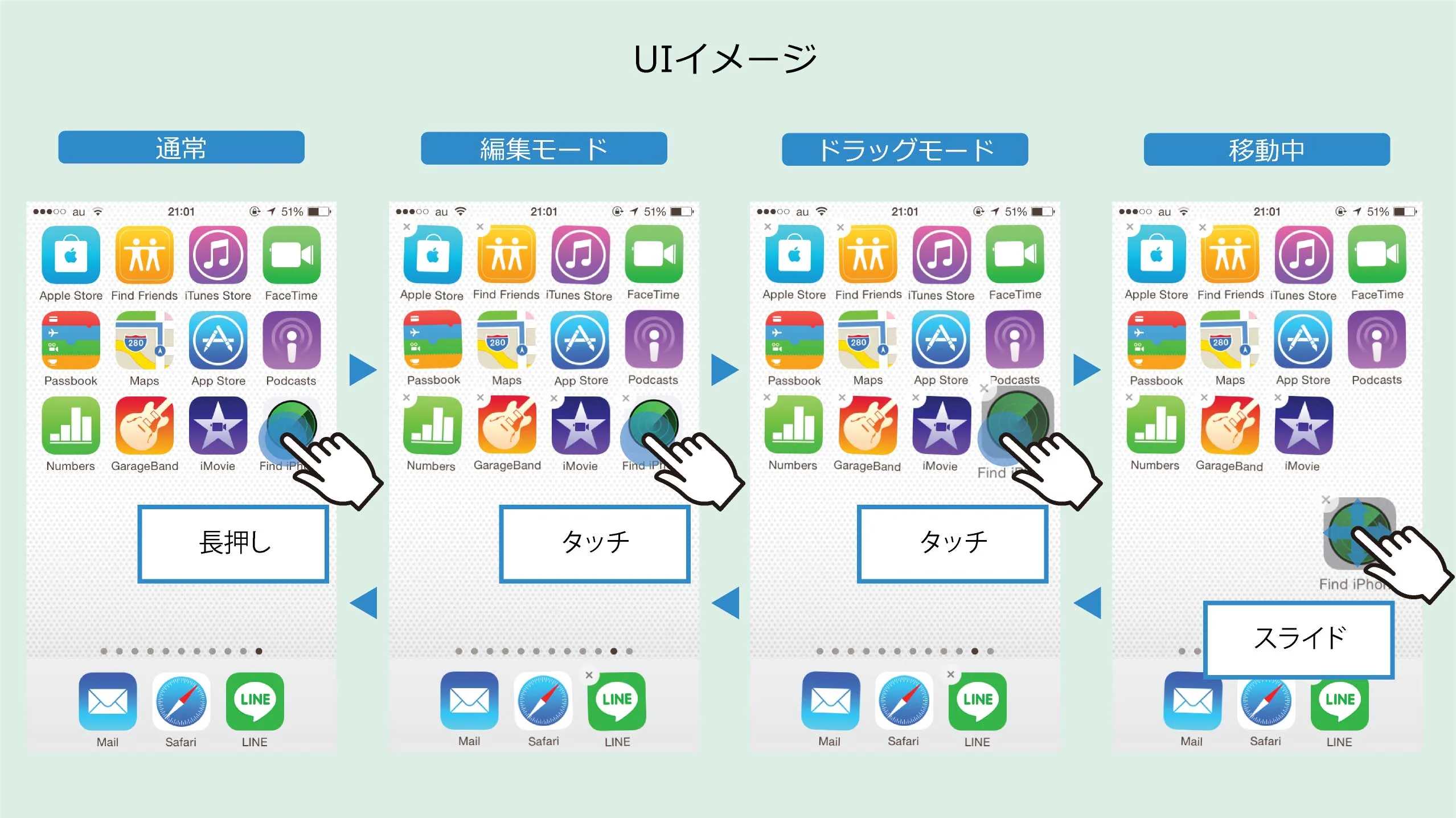
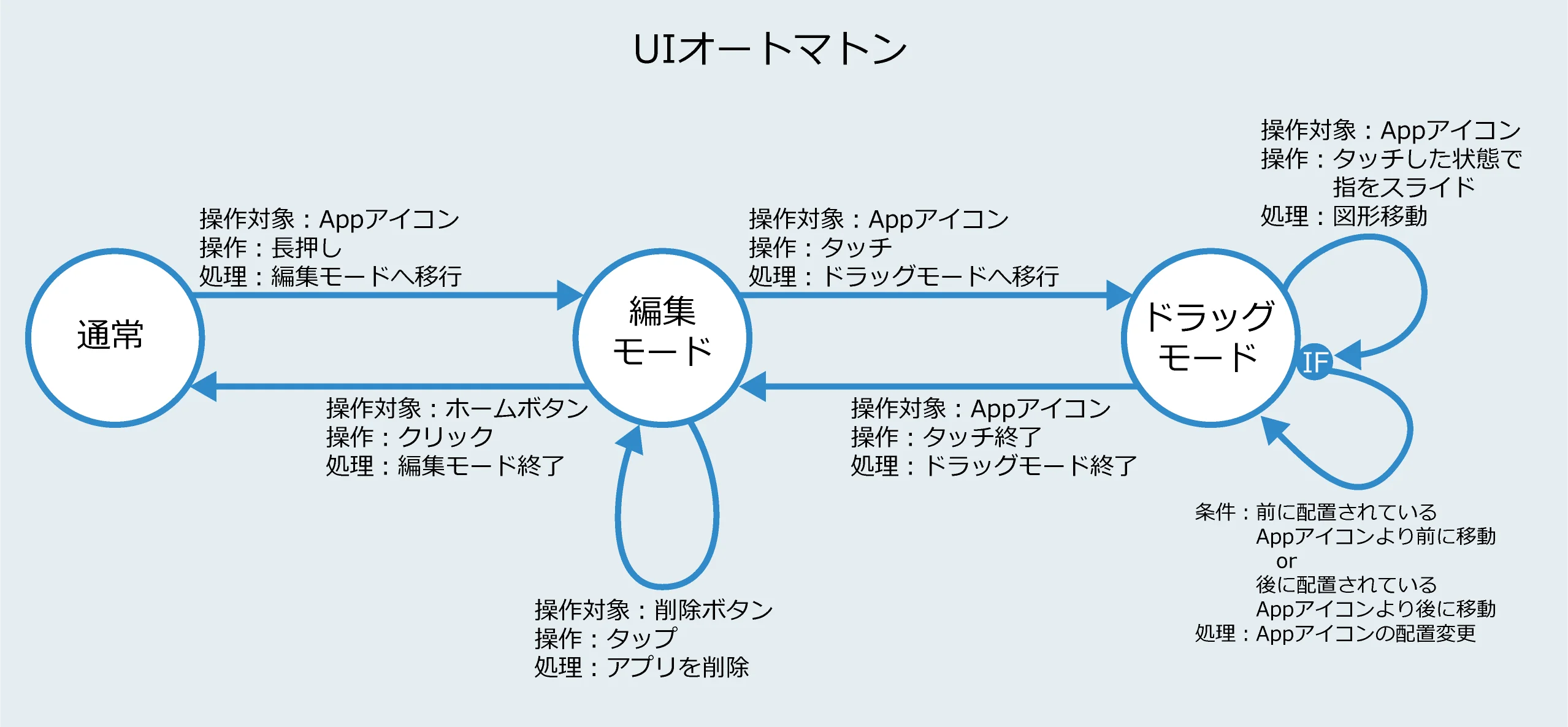
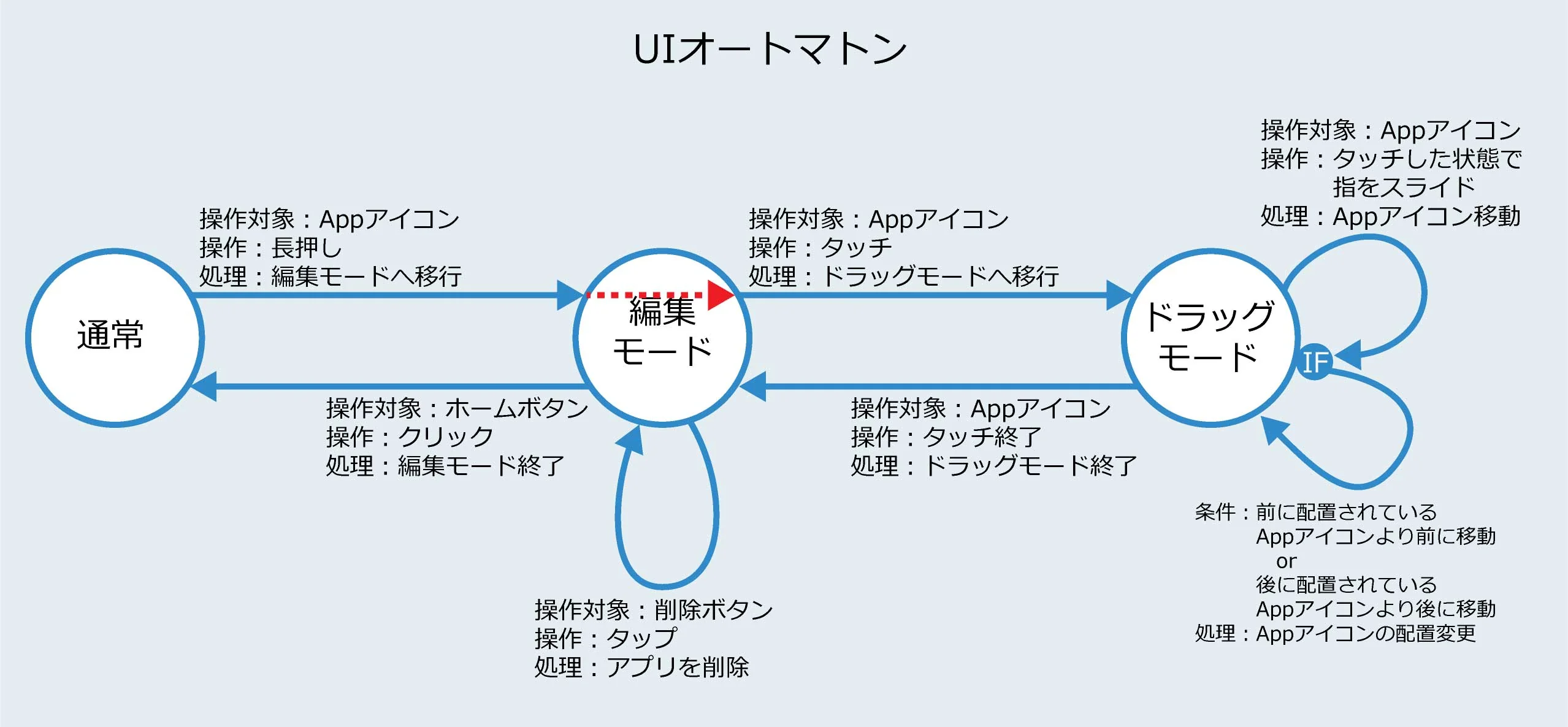
The iOS home screen appears simple. It is not. Beneath the surface of a straightforward icon grid lies one of the most carefully engineered interaction systems in consumer software — where physical weight and spatial memory are deliberately designed.
Execution & Design
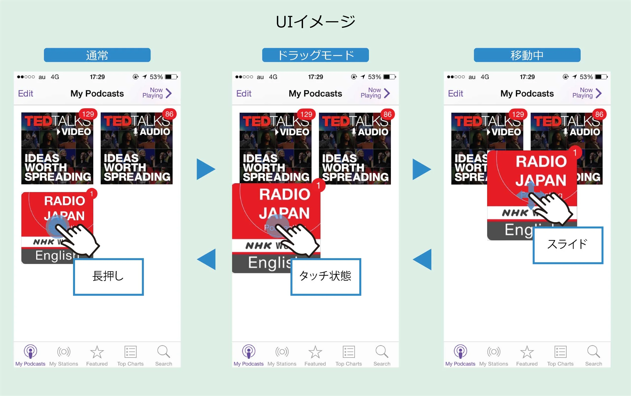
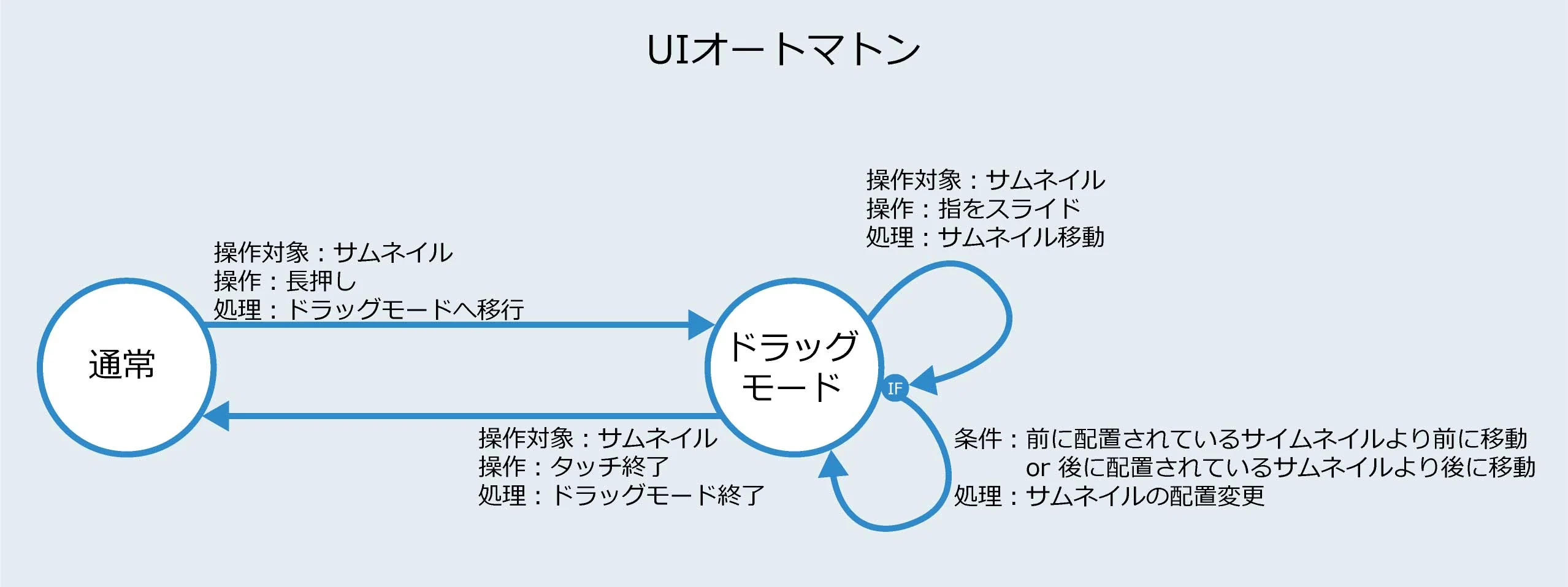
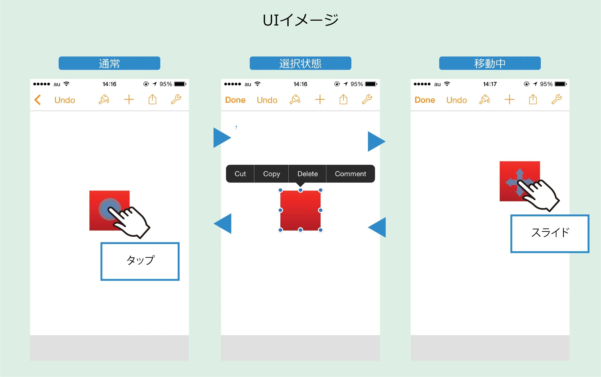
When a user picks up an icon, it lifts slightly and wobbles — mimicking the physical sensation of picking up a small object. The wobble signals moveable state and establishes a physical metaphor that guides all subsequent interaction naturally.
Impact & Growth
The spatial memory system is equally deliberate. Users develop reliable mental maps of where frequently used apps are located — and the iOS layout algorithm is designed to preserve these maps even as new icons are added, respecting user cognitive investment.
Conclusion
The lesson for interface designers: the best